Omni-Channel Request Dashboard
One of the pillars of a good business is meeting your customer where they are at. At Home Depot, one of the ways we accomplish this is by providing store product anywhere customers shop. This can be an internal challenge to ensure our systems and supply chain have proper setup to support transport from origin to customer. The Channel Management (CM) department manages any requests for a product to flow both to store and directly to the customer (known as omni-channel). This requesting process currently happens via email, making it difficult to track progress and communication.
My Role
My role: Sole UX designer.
Timeline: September - Oct 2024
A special thank you to my mentor, Kelly Mattingly, for being a weekly touch base as I navigated this design work!
Introduction

Problem Statements
- With a very demanding schedule and large purview of deadlines and responsibilities, Merchants must outsource operational tasks. They experience a lack of communication regarding omni-channel flow path request determinations from Channel Management (CM).
- CM spends hours per emailed request asking for and researching several databases for additional information before making a determination.
- When CM receives requests from associates other than the merchant, they cannot take action without merchant approval, delaying the onboarding process.

How might we...
- Centralize requests and relevant data coming in to CM?
- Create systemic/process requirements before requests reach CM?
- Pull all relevant information into one location to cut down on research time?
- Create a full-circle communication tool that allows users to quickly and easily prioritize requests?

Key Partnerships
This was my first design project with a full-balance team made up of product management and a team of software engineers. I attended weekly check-in's with these partners, and interviewed CM Analysts to ensure accurate data and design usability.
Research
___
Current State Analysis

Research
I was very excited to jump into my first cross-functional design project to get a better understanding of what it's like to work with a development team in a UX capacity.
Coming into the project, the Product Manager had already spent time with the engineers and a group of CM analysts to understand what the product needed to do and how it should function. Their research pointed them to a simple workqueue with dropdown functionality. Simple enough.
To break down the image above, CM receives one of three request types: onboarding, offboarding, or vendor swap. The analyst can then choose to accept, reject, or pause/delay those requests based on relevant data around the product. The problem current-state being that merchandising doesn't always receive the response determination with explanation.
User Flow Mapping

To help me understand pain points current-state and what systems this request platform would need to integrate with, I built out a process map/user flow to visualize outstanding questions in the end-to-end process.
For the request queue to function as intended, there would need to be a clear origin. Knowing that these requests are frequently coming from the merchant (or an associate of the merchant), we immediately run into a common large company complication. Merchandising has its own product teams and data security that are out of scope for the CM product team. In order for CM to receive the requests and to prevent additional back and forth, we would need access to their information. Additionally, there would need to be an intake form, or alerting system for required data entry.
Because this end-to-end process encompasses pain points beyond the scope of good design, I brought this up with the development team and asked them to research what could be done to ensure this data connection could happen.
Planning
___
User Interviews

Baseline Details:
Speaking with the two CM analysts used in the product team's research, I validated a table with drop-down functionality design. I received a good bit of detail on what level of data the analysts would need to review in order to make a determination, where that data should be sourced from, and what additional features the users would like to have.
Additional Requested Features:
- Confirmation/error alerting
- Post-action emailed digest
Design
___
Prototypes

CM reviews a different set of data than what I am used to seeing, and it took me a few attempts with the users to understand what was relevant for their decision-making process. I expanded my user testing to an additional 4 analysts to ensure I was getting a wide range of feedback through prototype iterations.
Tabular Design Feedback :
- The "Region," "SKU Status," and "Action Needed" columns were not value-add.
- Requested to be replaced with a more detailed "class" column, and a "Date of Request" column.
This functionality asked users to click on a row and then click the "Take Action" button in the bottom right, which they said was not intuitive to them. I would need to iterate on this design to draw attention to selecting a line item, then taking action.
Action Modal Feedback :
As the users played with the different drop down functions, they brought up concerns about needing to be able to type a different rationale in special circumstances. This would require an "other" option in the drop down, and a text box to appear in the modal.

Tabular Design Feedback :
With the second prototype iteration, the users were happy with the addition of the checkbox column, but expressed that they would like take action on multiple line items at once. This would require some iteration - systemically, I had to think through how users would take action on different request types (onboard, offboard, vendor swap) and associate reason codes with each of those.
The users also expressed they would like to filter the results of all incoming requests at the department level. We spent time discussing how CM disperses responsibilities and how the analysts further organize that. We discussed a single-sign on (SSO) login functionality that would filter the requests to their specific responsibility. The users brought up the use case of covering for each other if a co-worker is out of office. We came to agree that the table should aggregate up to a vendor-level and they would like to filter the results down to the department needed.
Action Modal Feedback :
While users were satisfied with the "other" text box functionality, but the ask to change the functionality of the table (specifically bulk actions) would require a complete redesign of the action modal.
Peer Design Critique
My mentor had encouraged me to join her team's weekly design critique and internal pattern alignment meetings to understand how UX groups peer review, create cohesive designs across platforms, and iterate on design work. I presented the new versions of the request queue redesign and received an immense number of things to think through.
Most notably, I have never worked with a standardized design studio. Home Depot uses Enterprise ANT Design Language for all internal-build software. ANT Design approaches a certain standard for how they evaluate design quality. Based on the assumption that "everyone is pursuing happiness at work", Home Depot has added the two values of "Meaningfulness" and "Growth" on the basis of "Certainty" and "Naturalness" to guide each designer towards better judgment and decision-making. The technology organization has converted to using ANT, which was a bit of a learning curve for me to learn how to incorporate those parameters into my work correctly.
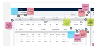
Effectively, I completely redesigned the table and action modal following the second prototype. The ANT system included an aggregated table with expand/collapse feature, which allowed me to aggregate the data to the vendor level as requested. I also attempted to eliminate the action modal by putting action buttons in the table. This caused too much confusion and ultimately did not last long in my iterating.


Accessibility

An interesting conversation we had in a design pattern alignment conversation with the UX team was around active/inactive action buttons. Originally I had designed the action buttons to be disabled if the user still needed to input information. This leads the user to reviewing their work over and over, potentially missing where they had skipped an entry field or required action. By systemically directing the user to where they need to select something or input an additional field if they click a button before completing required actions, the user can quickly complete work without having to carefully comb for missing information.
Final Design

Table Final :
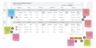
Users were very happy with the department dropdown functionality and the ability to search for specific SKUs in the top right. The action buttons in the bottom right require that any items selected are going to receive the same determination (approve, pause, reject). This function allows users to select any number of request types (more on this in the action modal section).
Now that the data aggregated to the vendor level, there were some unexpected additional complications. I did not realize that a given vendor may have several identification numbers depending on what channels that vendor's products went through. I was able to incorporate additional vendor-level detail into the action modal to make up for detail in the table.
The users also asked for a "Merchant Approval" column, which was a baseline approval requirement. There were a few additional SKU-level detail columns: "Online Cost," "Selling Intent," and "Online Disposition." These requests would lead to some additional unexpected complications (more on this in the project summary section).

Action Modal Final :
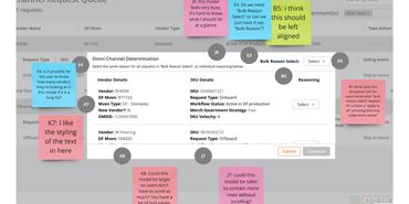
With the creation of the bulk action modal, came the bulk reasoning drop-down! This was an interesting feature I am still thinking through for future enhancement. This drop-down would only appear if the user selects all items of the same request type (onboard, offboard, vendor swap), since each of those come with their own reasoning rationales for each of the different actions (accept, pause, reject).
Ultimately, the users were happy with data separated into two columns at the vendor-level and SKU-level. This allowed them to double check that they wanted to take action on the items selected.
This modal also allows them the previous functionality of actioning single requests at a better visual of the data.
Next Steps
___
During the final stages of discussions, it became evident that this project would not receive funding for development. When the product team inquired about rolling out a simplified version of the design, feedback from CM analysts suggested that without implementing the full design, development would not be worthwhile.
Key challenges that were identified included workflow dependencies and data accessibility. The start and end of the workflow required changes to how merchandising creates, reviews, and receives communication about requests. However, these processes were deemed out of scope given Home Depot’s current organizational structure. A critical part of the project involved SKU-level data, which is owned by Merchandising rather than CM. Without funding, sourcing this data was not feasible, creating a significant roadblock for development.
Reflections and Takeaways:
One of my leaders noted that outcomes like this are not uncommon. Despite the setback, I’m proud of this design and I am hopeful that it might eventually be implemented. From this experience, I’ve learned valuable lessons:
- Due Diligence: While I relied on the product team’s research, I realize the importance of conducting my own. I assumed that upstream work on the merchandising side was completed, that there would be no change management hurdles, and that incoming requests would already be vetted and ready for action. I was mistaken.
- Proactive Inquiry: Going forward, I will make it a priority to ask deeper questions about the design requirements and verify the feasibility of supporting the design, particularly regarding data accessibility and cross-functional dependencies.
If I were to approach this project differently, I would focus on engaging stakeholders earlier to ensure alignment on scope, dependencies, and the availability of critical data.
Copyright © 2024 Tyler Sarkis CREATES - All Rights Reserved.
